Thursday, 19 December 2013

First Draft of Magazine Front Cover & Double Page Spread
FRONT COVER

DOUBLE PAGE SPREAD

I used Photoshop to edit the image and then i used illustrator to create the structure of my front cover and double page spread. I kept to my house style.
Thursday, 19 September 2013
Editing of chosen images
In this presentation it shows some editing i have done on some photos that i had taken, it helped me make the image more better and attractive.
Final Chosen Photos
DOUBLE PAGE FRONT COVER

These images are the image i have chosen for my front cover and double page. The reason why i have chosen these images because it suits it perfectly for example the clothing worn suits the urban look which is related to my genre. The pose is also a typical RNB look that attracts an audience.
All photographs taken for the cover and article pages

Here are all the image i have taken for my magazine front cover, contents page and double page spread.
Planning for photographs
This is my photo shoot plan i will be showing how i planed and constructed my photos.
Improved draft of pages (with internet images)
Contents Page

Double Page Spread

Peer Assesment
Peer Assessment
Student
Name 1:
Phoebe
|
How
To Improve
|
|
Level/ Mark
|
Front Cover
|
Contents Page
|
Front Cover: LEVEL 2, MARK 30 because
there is a central image with lots of puffs and buzz words. There is also an
anchorage text with grabs my attention. The color scheme is consistent and
there is a range of fonts which made it look interesting for me.
Contents Page: LEVEL 3 , MARK 40
There are a lot of images and you kept
to the color scheme which is good. You have included the editor’s note.
|
The image looks a little unprofessional
as it isn't correctly cut out. The
background color is simple and plain, there needs to be color so it looks
more attractive.
|
The contents page layout looks a little
unorganized, the images are not aligned and straight. It overall looks simple
and plain. There needs to be more colors so it looks more attractive and eye
pealing.
|
Student
Name 2:
Dolvani
|
How
To Improve
|
|
Level/ Mark
|
Front Cover
|
Contents Page
|
Front Cover: LEVEL 1, MARK 5 Because the front cover there is a main
central image and are a few puffs The title is big and easy visible.
Content Page: LEVEL 2 , MARK 24
There are images and there is lots of
content. The title is big and visible; there is also lots of image.
|
There is no house style, and the bar
code is too big on the magazine, there are no linked to Facebook or twitter.
There are no anchorage texts
|
The images are organised and messy,
there is not enough color…
|
In this post, i peer assessed two students front cover and contents page. I used a mark scheme to help me mark the magazine front cover and contents page.
Original article draft
I first began making videos on YouTube nearly everyday; it got hundreds of views on all
my videos. I began to upload more and more until I reached more than one
million views and one day I finally reached my goal, I had more than 10 million
views on one of my videos which got me noticed around the country and the
world. People liked the sound of my voice, I did rap, RnB and many other music
genres because I wanted everyone to like me and it worked. I got heaps of
emails and messages from artists and people saying I am a future star or I am
the next Eminem or Chris Brown which boosted my confidence. I continued to make
new videos for months until I got a letter from a UK music record label saying
they wanted to sign me... I agreed to join the PAN UK record label.
Before I was signed by the best UK record label my lifestyle was simple, I had one routine everyday which was to wake up, go to college, hang out and go to sleep. My lifestyle was straightforward; I didn’t work or have a job. I would sing in spare time and on the weekends I would perform in front of a few people in a local youth club. My life has changed loads since I had been signed by a record label. I have been performing in front of millions of people nearly every day and on other days I would be practising my vocals and improving my style. I have no time to hang out as I am busy with my latest song which is out next January. Get buying.
The first type of music I began to listen to is rap, I use to listen to the god tupac, snoop dog and others. I was introduced to RnB by friends when I started to secondary school. I enjoyed listening to it a lot and I tried to copy the style of singing, I got better and better and I stuck to the RnB type of music. I am now writing and singing songs which are RnB with a little rap to mix things up and it would also reach a wider range of an audience. My main artist which u use to listen to is Drake, I used his style of singing to find out what type of singer I am because I sound best when I am singing RnB songs and everyone loves it.
I would never of thought I would become this far because I know there are many more
upcoming artists who are miles better than I am and I didn’t know how to become noticed but I guess I got lucky by getting noticed. I didn’t believe in myself at first to come this far but then I began believing which pushed to want this goal more and it got me far as sitting here now. My family also helped me get this far, without them I wouldn’t be here talking to you. I just waited till I got noticed and it worked, I am here now, I have achieved my goal, I am happy and I hope my albums sell!
Before I was signed by the best UK record label my lifestyle was simple, I had one routine everyday which was to wake up, go to college, hang out and go to sleep. My lifestyle was straightforward; I didn’t work or have a job. I would sing in spare time and on the weekends I would perform in front of a few people in a local youth club. My life has changed loads since I had been signed by a record label. I have been performing in front of millions of people nearly every day and on other days I would be practising my vocals and improving my style. I have no time to hang out as I am busy with my latest song which is out next January. Get buying.
Being famous and singing in front of millions of people has
always been my goal since I was 1 years old. I began singing at 5 years old; I
sang all day everyday when I got back from school. I entered a singing
competition and came first which gave me a massive boost in achieving my goal.
I performed at weddings, pubs and I started doing gigs. I had one dream that
was to become an RnB singer and even a rapper. I was told by everyone that I
was good and that boosted my confidence a lot and helped me reach my goal
easier. Once I had reached my goal I felt relaxed and relieved that I had
achieve what I had been dreaming of for years.
I have loads of inspiriting like my family, friends and
obviously my fans and also my favourite RnB artists like Drake, Lil Wayne,
Chris Brown and many others. I use to listen to these artists everyday and it
inspired me to become a singer myself as I wanted to become just like them. I
wanted the money, the big house and cars. My family is my biggest inspiration
because they are always there to support me and they pushed me to become a
worldwide famous RnB singer even when I was too scared to sing in front of
hundreds of people. I had a vocal disease at the age of 15 which made my voice
different. I had to practise every day until my voice was back to normal. I
didn’t stop practising until my singing was better than it was. I became a
better singer after years of practising and I knew I would make it far.The first type of music I began to listen to is rap, I use to listen to the god tupac, snoop dog and others. I was introduced to RnB by friends when I started to secondary school. I enjoyed listening to it a lot and I tried to copy the style of singing, I got better and better and I stuck to the RnB type of music. I am now writing and singing songs which are RnB with a little rap to mix things up and it would also reach a wider range of an audience. My main artist which u use to listen to is Drake, I used his style of singing to find out what type of singer I am because I sound best when I am singing RnB songs and everyone loves it.
I would never of thought I would become this far because I know there are many more
upcoming artists who are miles better than I am and I didn’t know how to become noticed but I guess I got lucky by getting noticed. I didn’t believe in myself at first to come this far but then I began believing which pushed to want this goal more and it got me far as sitting here now. My family also helped me get this far, without them I wouldn’t be here talking to you. I just waited till I got noticed and it worked, I am here now, I have achieved my goal, I am happy and I hope my albums sell!


Moodboard of RNB specific article pages

On most of these articles there is a title which is big and bold, its easily visible to give the reader information of what it is about. There are many long shot images, this tells us about the models body language and how they are feeling towards the article and the audience. Nearly all the articles on the mood board begin with a drop cap to indicate to the audience that the article begins there. There are some pull quotes on some of the pages to show the audience that it is real and they would want to read on. There are also at the bottom some social networking websites where the audience can go an see and explore more about the articles. These articles will help me produce my own magazine to a professional standard.
CONVENTIONS:
- Title
- Main Image
- Drop Cap
- Article
- More images
- Social Networking Links
- Pages
- Magazine Logo
- Sub Heading
- Albums
Moodboard of RNB specific contents
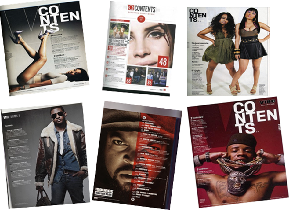
Here is a collage of some RNB content pages, i made a collage of this because i am going to make a my own magazine which is RNB therefore i have an influence of some content pages and it will give me an idea of what they look like.
In most content pages the camera shot taken is usually a mid-shot to a long shot this is because it gives a hint of who the main focus of the magazine is. A mid-shot is used to see their upper body language and a long shot is used to see their whole body. The main image is bigger than the text and other image is because they are the main focus and it wants to attract an audience. There are a variety of page numbers to indicate what the magazine contains, it also shows the readers that the magazine has a lot of information and gossip which are interesting
CONVENTIONS:
- Title Block
- Contact Information
- Date
- Adverts
- Editors Note
- House Style
- Date Issue
- Social Networking websites
- Subscriptions
- Page Numbers
- Sub-heading
Moodboard of RNB specific front covers

Here are some RNB magazine front covers. I chose RNB because it is the same genre as my very own magazine. Most of these magazines have a mod-shot or close up shot of the artist, the reason why is because it shows the artists body language and facial expressions in detail therefore the audience know how they are feeling or what type of magazine it is. They are also the main focus of the magazine to attract the audience because they are a celebrity, this is called celebrity endorsement.
The costume used is main showing a lot of their skin or wearing a lot of jewelry for example on the second magazine on the second row it shows a man showing is muscles with no top to attract an audience and on some of the other magazines jewelry is worn to show they are rich and the magazine will be good. A lot of RNB magazine are similar as the images taken of the artist look serious. They way they are portrayed tell us what type of genre it may be.
The font styles used in these magazine front covers look very similar because they are big and bold, they stand out to grab the readers attention. Not only are they big and bold they are also in blocks texts which make it stand out. The colors used are also bright and attractive to instantly grabs the readers attention to make them read on and buy the magazine. The font colors also stick to the house style which makes it look professional.
The overall representation of the artists tell us that they are serious and take their job seriously which is to produce enjoyable music that people would like to listen to.
CONVENTIONS:
- Title Block
- Slogan
- Bar Code
- Buzz words
- Anchorage Text
- Puffs
- Central Image
- Graphic Features
Chosen Title Block


As you can see above i use a poll to decide which title block everyone liked. The most popular title block was number 2 therefore i chose this title block as my primary title block. The title block is suitable because its bold and big and it suits my target audience.
Potential designs for my title block
Theses are some title blocks which could possibly be on my magazine. I have made a poll to decide which one people like best.
1:

2:

3:

Title Block Analysis

Just
from looking at the title, I instantly think it’s a rock genre music magazine
because of the title and the font. From looking at the font or the text, I
could tell straight away that the type of genre the magazine is rock as the
text says Rolling Stones, the font also is scruffy with lines which also
suggests that the magazine would be rock. The colours used in the title is red
which suggests that its dangerous loud music therefore the colour suggests that
its rock music. The title itself tells us that the magazine will contain
content related to rock. The title tells doesn’t really tell us what audience
it is aiming at.

The title NME
tells us straight away that the genre of the magazine is RNB we know this from
the colour, they are red and white which are similar to the other magazines. We
know that NME is a mainstream magazine because it is known and the title stands
for New Musical Express. The title is short and snappy which tells us that it’s
not a serious magazine.

The title Kerrang instantly tells us that the
genre is rock from the font and the style of writing for example the lines in
the words. It also is black which gives a dark feeling and punk. The exclamation mark also suggests that the word is being shouted and
the genre rock is a loud type of
Final Proposal and Audience Profile
This is my final magazine proposal for audience and main artist. I have added a character profile to give you an idea of what type of person would buy my music magazine.
Star Image Analysis
I have analysed different celebrities in four different magazines, i done this because it would help me to construct my very own magazine when taking pictures of my models and artists. It gave me an idea of how my model will pose, look and wear so it would attract my audience.

Setting/
Location
|
The
setting is set on a plain background to make her stand out to the reader, it
also shows her confidence towards the audience.
|
Costume/
Props
|
She is
wearing a unique dress which is very feminine, this tells us she is a fashion
icon/ model. She is showing some skin which tells us that she is confident
and is trying to attract an audience. It also tells us she is is full of
goodness as she is wearing a lot of white. The black also connotes she has
some power and she is mysterious.
|
Camera
Shots
|
The
camera shot used is a mid-shot as its showing from hip towards. This is
telling us that the clothing worn is the main focus and it wants to be seen
by the reader. It also shows her body language in detail.
|
Lighting
|
The
lighting used is very high key, it mainly focuses on the model. The high key
lighting bounces off her skin to make her look attractive and it the lightest
color other than the white. The lighting brightens the mood.
|
Facial
Expressions/ Body Language
|
The
models facial expression is very happy as she is smiling, she is looking
directly at the camera and is standing with her hands on her hips. Her hand
are on her hips to show her arms and the shiny skin to make it more
attractive.
|
Anchorage
Text
|
The
anchorage text 'FALL FASHION', this tells us fashion is falling and this
model is there to make fashion known again.
|

Setting/
Location
|
The
setting/ location is a red background as that is the house style, it connotes
danger and hot
|
Costume/
Props
|
The
costume worn by the model is very shiny which stands out for the audience
this may because the clothing worn is the main focus in the magazine. The
model is also showing a lot of skin to attract a wider audience, the costume
shows her body figure which also is trying to attract the viewer.
|
Camera
Shots
|
The
camera shot taken is a mid shot which tells us that her clothing and body is
the main focus. Her body language is telling us about her personality to
towards the audience,
|
Lighting
|
The
lighting used is very high key, this is used because it makes the model stand
out and it makes the mood of the magazine more better. It also brings out the
feminine side of her. The light bouncing off her makes her look even more
attractive.
|
Facial
Expressions/ Body Language
|
She is
looking at something with her hair being blown back which shows she is posing
for the camera it also look attractive which would make the reader buy the
magazine. She has her hand on her thighs with her dress lifted up to make her
look hot and feminine.
|
Anchorage
Text
|
The
anchorage text got this magazine is 'SEXY SWIMSUIT' this tells us she is
promoting a swim suit that is sexy and unique.
|

Setting/ Location
|
|
Costume/ Props
|
The costume which is worn by the model is a bikini which shows a lot of skin, the reason why this was used is because it attracts a wider range of an audience. The props used is sand, this could suggest that it is a summer magazine it also makes her look a little dirty. It also makes her look seductive.
|
Camera Shots
|
The camera shot that is taken is a long shot to show the whole body of the model to see the body language and her pose.
|
Lighting
|
The lighting used is high key to show her body in more detail and it makes her look even more seductive.
|
Facial Expressions/ Body Language
|
Her facial expression looks serious this refers she is serious about what she is doing. Her facial is normal which may suggest she doesn't need to make faces to look sexy. Her body language looks like a seductive pose, he hands are on her hips. Her chest is out which may mean that she is trying to look seductive and hot.
|
Anchorage Text
|
The anchorage text 'GOODNESS' means she is a good person.
|

Setting/ Location
|
|
Costume/ Props
|
The costume which is worn by the woman look like a dress that shows some of her skin, the color of it is white. White connotes goodness, innocence and safety. The props which are used are twin babies which may relate the the story of an article.
|
Camera Shots
|
|
Lighting
|
|
Facial Expressions/ Body Language
|
|
Anchorage Text
|
The anchorage text 'TWIN BLISS' suggests that the babies are the reason why she is happy and joyful. It is big and bold which makes it stand out.
|
Focus Group
In my Focus Group i asked 3 student some questions about my music magazine which i will creating, i asked them questions so i could get an idea what should be in my magazine. I asked questions such as should my magazine be published online which i got a response of yes as teenagers use the internet a lot these days. I also asked whether my magazine should be priced £2.50 or below and i got the response of yes as teens only get pocket money. At the end it gave me an idea of the basic things that my magazine should have.
Audience questionnaire and results with comments

In this question I
received a total of 15 responses; it came to the conclusion of the magazine Q
having the most votes out of the rest. The magazine Kerrang came second
followed by NME then Top of the Pops. This gave me an idea of what my target
audience should be when I create my magazine.

In my second question
in my survey, I asked how much would people spend, the highest vote was £2 (7
people) compared to the lowest what was £4+, this gave me an idea on what price
my magazine should be so it would be become a success and more people would buy
it.

In
this question I collected information which would help me when to release new
magazines. Most people voted once a week which gave me a hint on when to release
new magazines so more people would buy them. The lowest was Everyday and twice
a week.

People
voted Latest Gossip the most which helped me decide what to put in my magazine,
the lowest was Quizzes with 0 voted which made me think that people don’t want
that. Latest Gossip was 46.7%.


I asked what magazine
people currently read so that I know what kind of magazine my magazine should
be as good as. The most voted was other which meant people read a variety of
magazine. The lowest was Q with 1 vote which was no so popular.

I asked
what people expected in a magazine, people voted celebrity gossip the most
which suggested to me in my magazine, the lowest vote was new songs and latest
new which wouldn't be recommended in my magazine. This also gave me an idea on what
should be in my magazine.

The most votes in the
question was articles, latest gossip and images this told me what kind of
things were attractive to people, it also have me information on what things to
put in my magazine that would attract an audience. The lowest was quizzes with
1 vote.

In this question I
offered a few magazine titles and the one with the most votes was Music Maniac with 5 votes, this gave me an idea of what kind of titles I should put in my
magazine so it would sound more interesting and attractive. The lowest was
other titles.

In the last question I
asked whether people bought their magazine in shops or online. It came to the
conclusion of Local Shops and the lowest vote of Supermarkets and Online this
gave me information on whether to create a website and where to sell my
magazine.
Subscribe to:
Posts (Atom)